The Colour Matching App Case Study

Design a mobile phone application that can identify exact colours from photographs, and link users to a paint product that matches.


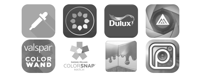

2.6 stars. That’s the average review score (out of 4200+ reviews) for the most popular apps in this niche. What went wrong? Some apps such as ColorSnap went so far as to require a separate device before being functional, while some were costly for little features. many had outdated UI and lacked recent updates, sometimes stretching back 5 years or more.
Strengths - Color Name Ar Pro is head and shoulders above the rest, it has a clean, modern ui and positive reviews.
Weaknesses - Difficult to navigate, paid service.
Oppourtunities - Could offer similar colours as well as identical match, does not reference in hex, could include a way of linking relevant products.
Threats - Dulux Visualiser only offers a matching service for exact colours in their own paint range, if expanded would pose a threat.
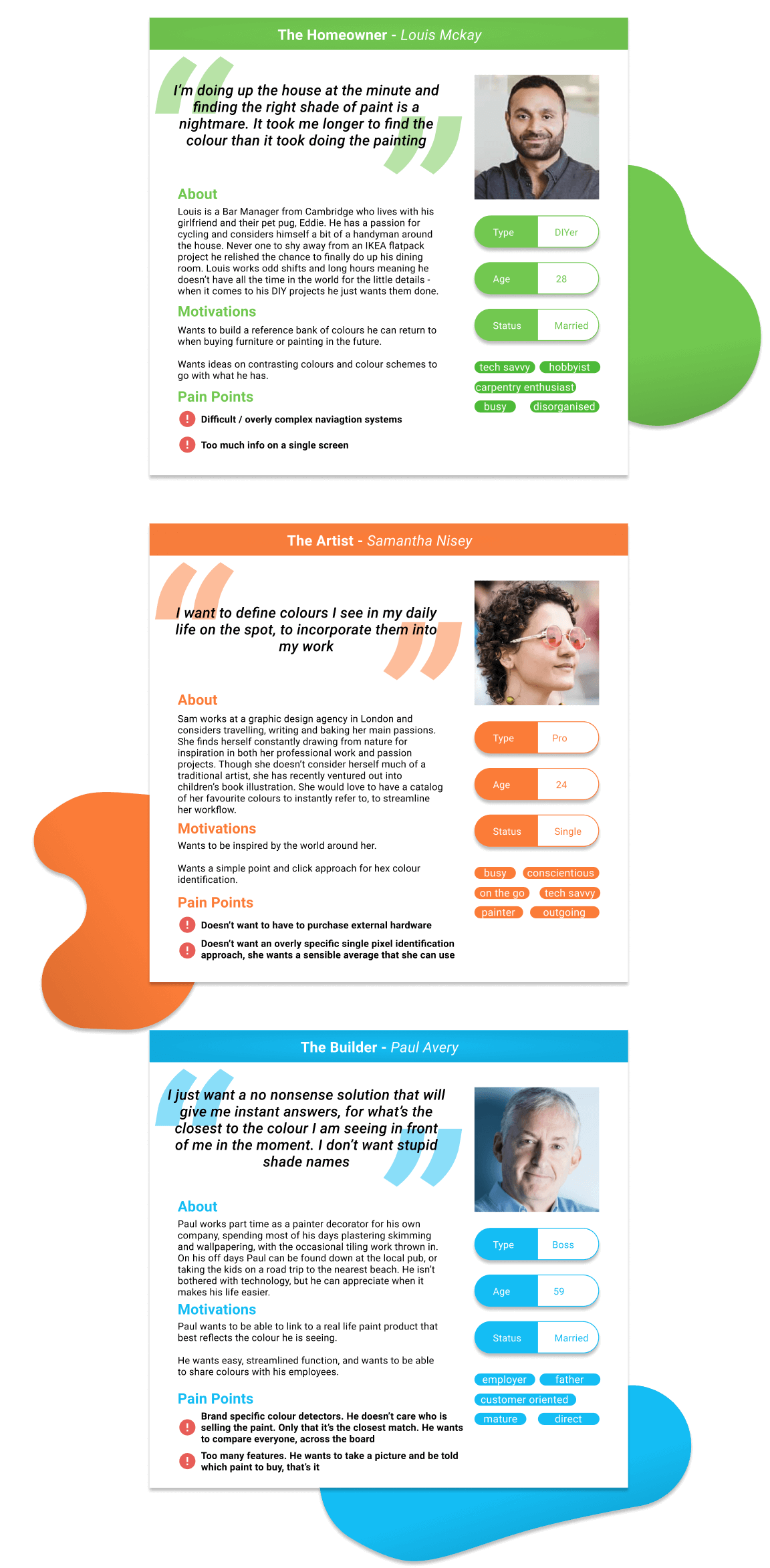
Three main target demographic archetypes were considered after user interviews.
A DIY painter looking to change up their home
A professional graphic designer looking for inspiration in their daily life
A student exploring colour theory


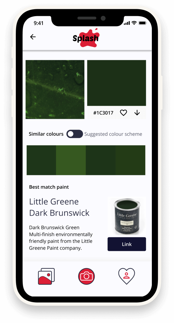
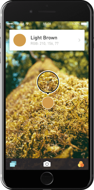
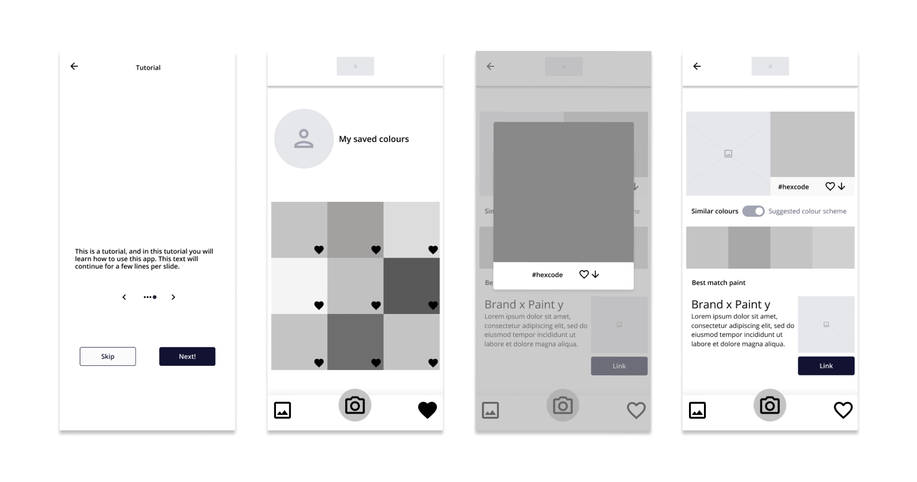
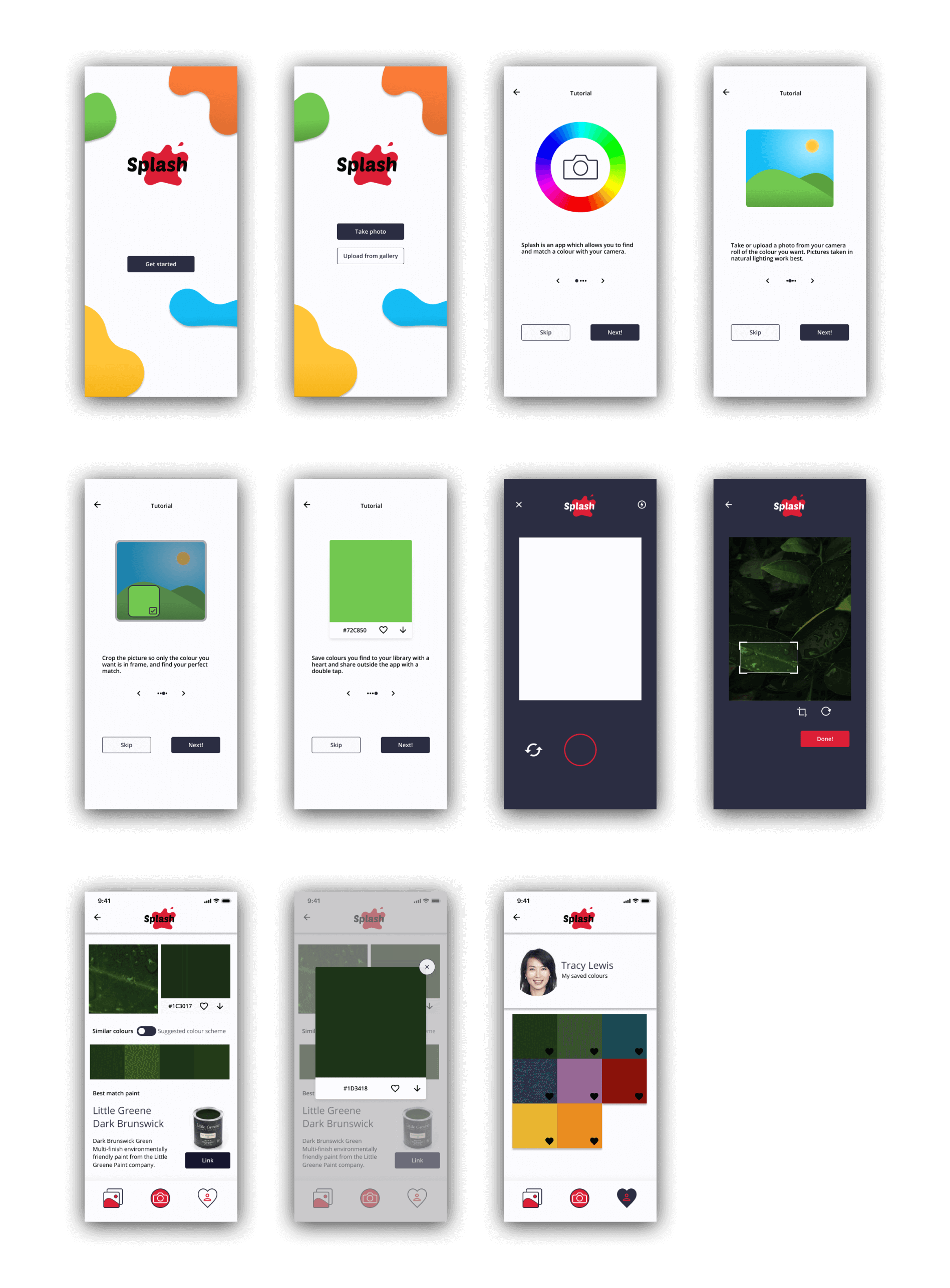
The MVP for this project is an application which has a native camera function, that allows taking of photos and selection from photo galleries, and analyses the photo to find a match for average pixels over a set area, to give users the closest guess to a hexadecimal colour, as well as a best match paint product. It will also allow users to save colours for later reference, and share colours outside of the application.

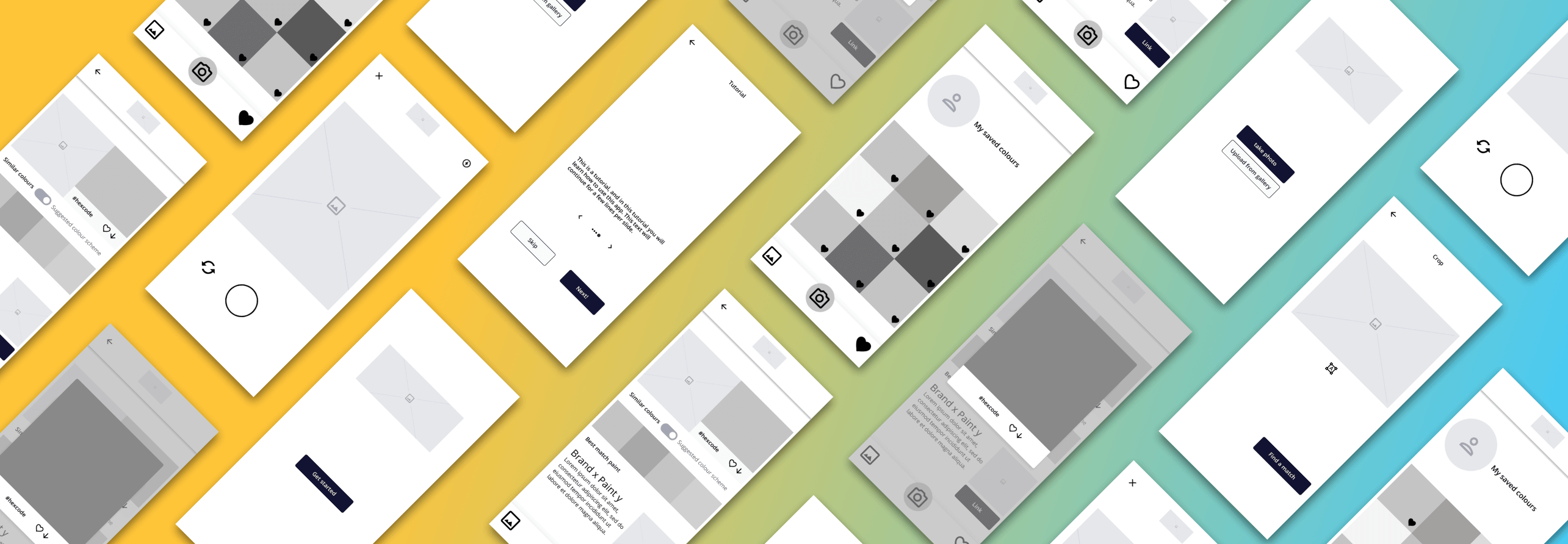
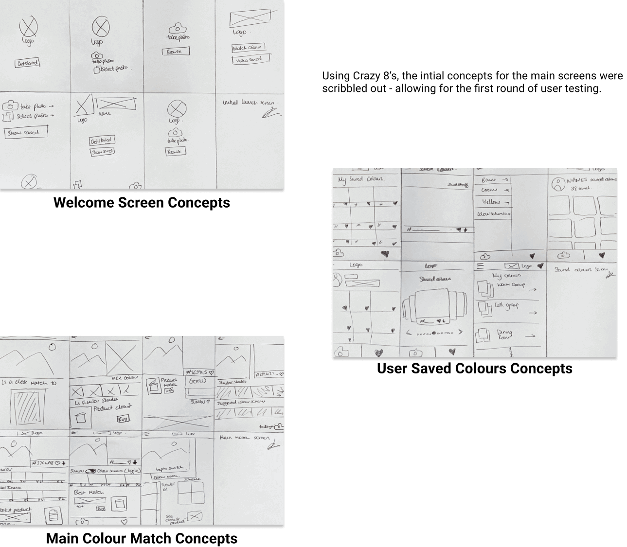
At this point in the process it was time to create some low fidelity mockups and prototypes to refine the user journey in real time. Playing around with screen layout, visual themes and iconography were essential here. From wireframes to more fleshed out renders, this stage of the design came to a close with defining the moodboard and style guide for the final mockups, with a bit of logo design and branding thrown in the mix.

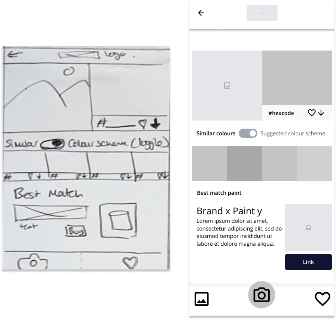
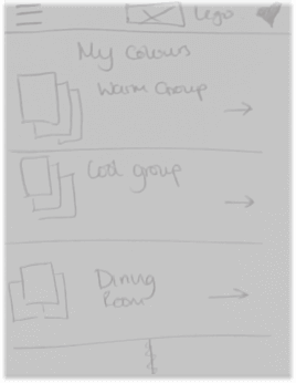
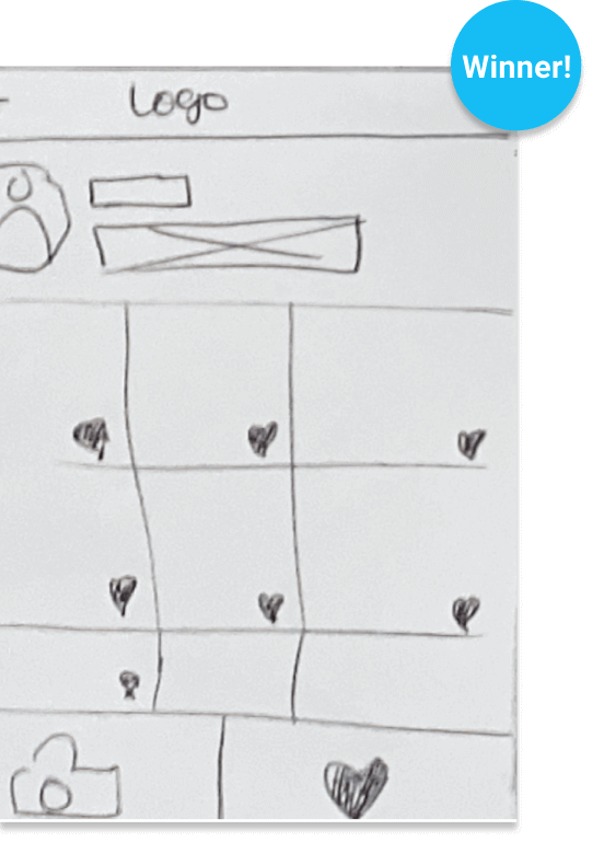
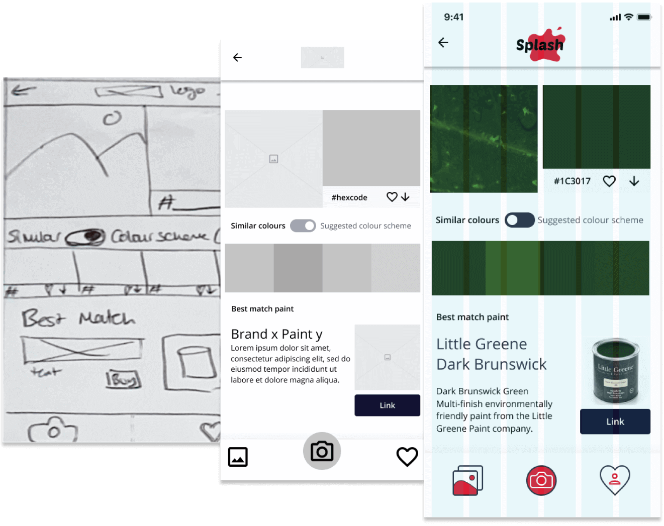
The next step was to breathe some life into the concept and quickly produce some deliverables, to start A/B testing and get that all important user feedback. Starting with scribbled wireframes (excuse the handwriting!) To lo fi mockups and polished, functional prototypes, the app went through several different iterations with the help of affinity mapping, split testing, and good old fashioned surveys.


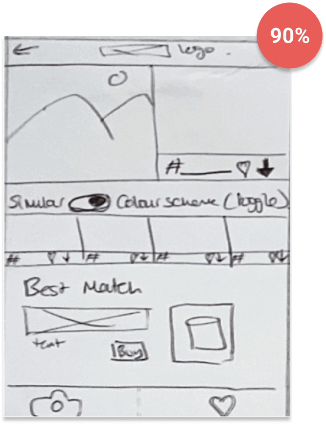
90% of users preferred the layout and navigation method of the wireframe on the left. Confident it was statistically significant this navigation method was selected.
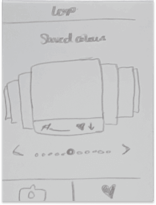
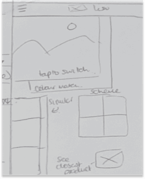
55% of respondants chose the central layout as their favourite.
With a round of user testing complete and some actionable data it was time to quickly whip up some low fidelity mockups to refine the user flow and iron out any obvious flaws. From intial testing it was suggested that an upload from gallery button should be added to the navigation bar, and so it was introduced at this step.

The aim of this mood board is to capture a sleek, crisp aesthetic - to let the colours captured in app speak for themselves.
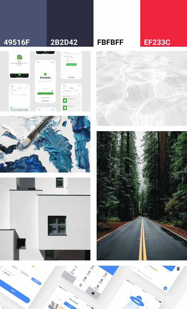

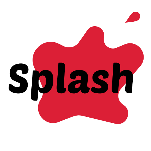
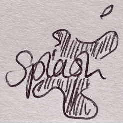
With a fairly strong idea of what direction to take the app in aesthetically it was time to create the brand. Eventually a brand name - “Splash”, and a simple two tone logo were created to give the final mockups some substance. Given best practice and accessability considerations, clean, universally recognised icons were used for the majority of the project, however a few were custom created for navigation, to build some branding and flesh out the app.

Two sets of navigation bar icons were created, but ultimately users found the set on the right to be more appealing and so these were selected.


Now it’s time to start pinning down the design and creating some realistic mocks, and play with some prototypes to iron out any last issues. Pixel grids helped keep spacing in check, with best practice guides from Apple and Google keeping the formatting tight.


Being a short project, the user journey for Splash had to be mercilessly refined. However, looking to the future this leaves numerous oppourtunities for a second phase. A search feature should be explored, some in app settings could be added, and a counter next to the colours illustrating how many times that colour had been found in-app could also be added for novelty. It also wouldn’t be difficult to commercialise this product and include advertising within the list of suggested products.
 Let's Chat