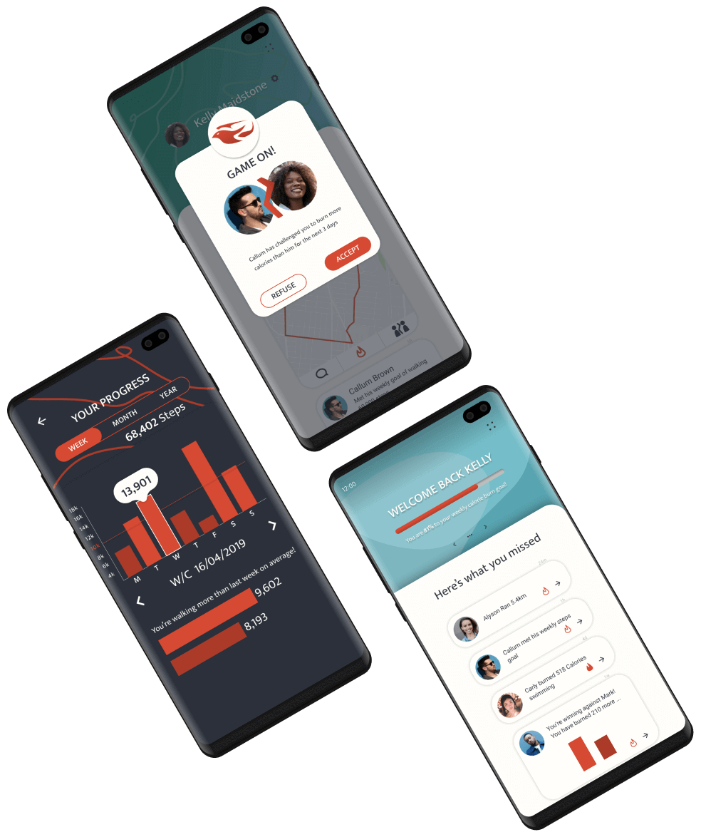

Design a cross platform mobile phone application that functions as a fitness tracker and social media platform to encourage users to lead healthier lives.
The first and most immediate problem to overcome in this project was the definition of what the app should do, and what was superfluous to achieving this objective. The app needed to track and display workout and caloric information, as well as allow posting for friends to see. It also needed to motivate users to continue their fitness journey and allow interaction between users.
After conducting some research and highlighting design parameters several key categories were locked down for the project. Exercise and nutrition tracking, as well as a social side with multiplayer gamification would be the basis for the app.
Fitness enthusiasts were the obvious overarching target user for this product, but breaking this down further allowed for better insights and journey refining.
Following interviews, users raised further points they would like addressing. Users wanted to be able to set goals for weight loss and gain, and for macronutrient breakdown.
This is the original userflow for the project, however as the app took shape the navigation changed. Challenges were made more central to the MVP and the activity feed and profile subsections were merged to create a more streamlined user experience.
With a rough idea of the user journey and minimum viable product for this project, I decided to focus on sketching the home page, which would act as a dashboard and springboard for other features.
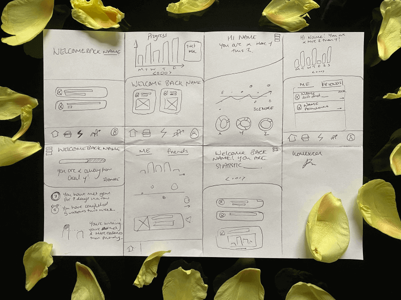
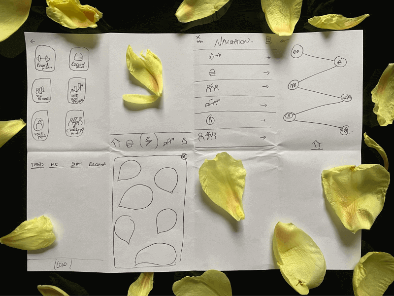
A big topic of contention at this point is the method of navigation, as we didn’t want to rely on the usual navigation bar mechanism, but were keen to keep the interface as clean and intuitive as possible.
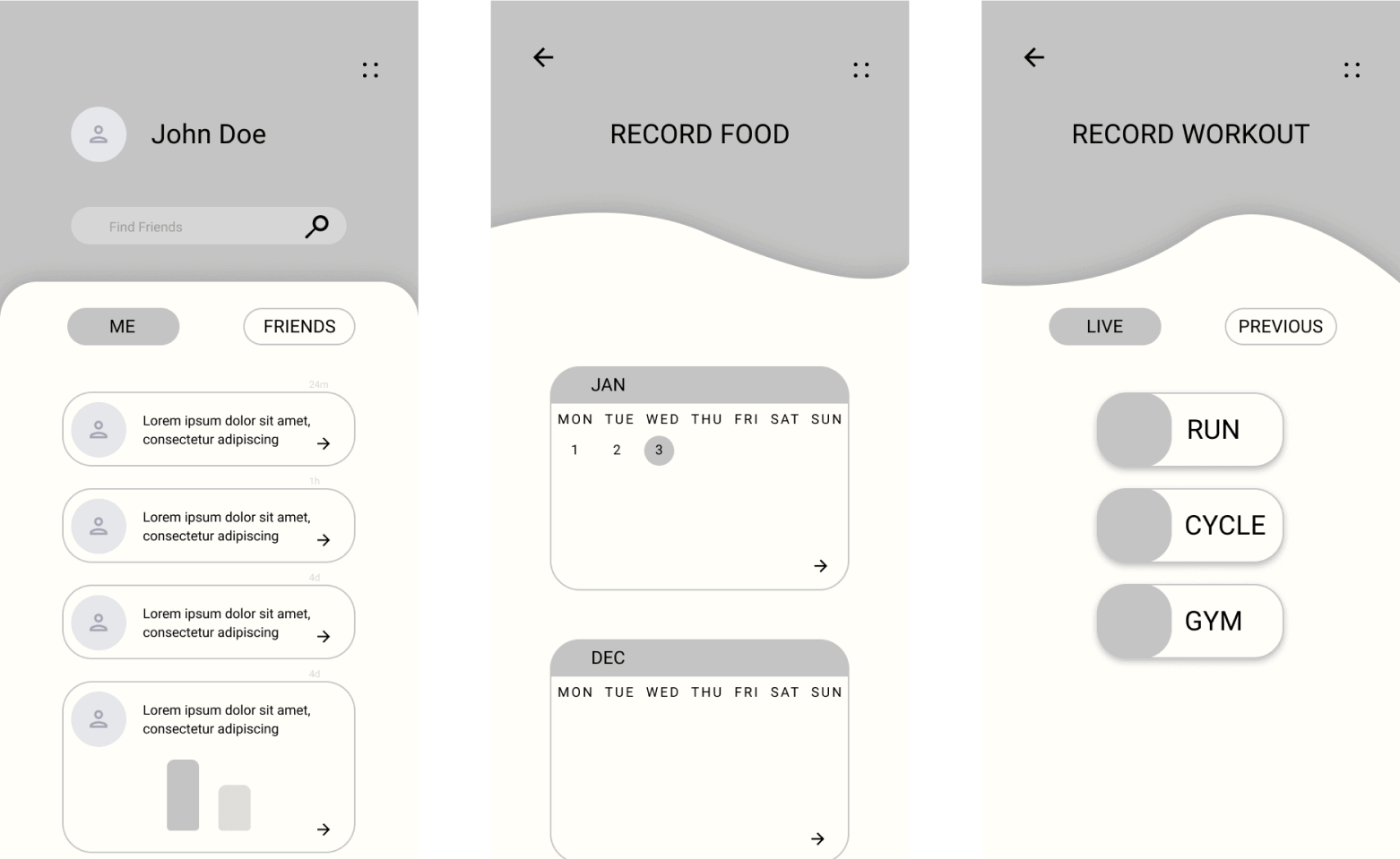
The next stage in the project was to create some low fidelity mockups that could be shown to users and used as a tool for explaining functions within the app, and prototyping.
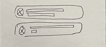
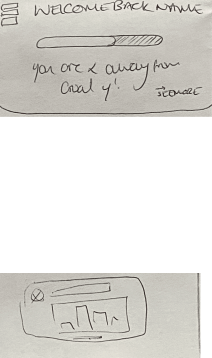
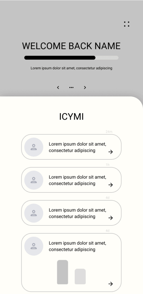
Popular elements from different sketches were pulled together to build the first mockups, feedback indicated users liked both the welcome message and the statistical overview, so these were combined and added as swipe cards. To keep things moving, I was conscious of UI as well as UX at this stage and began building the structure of the app.
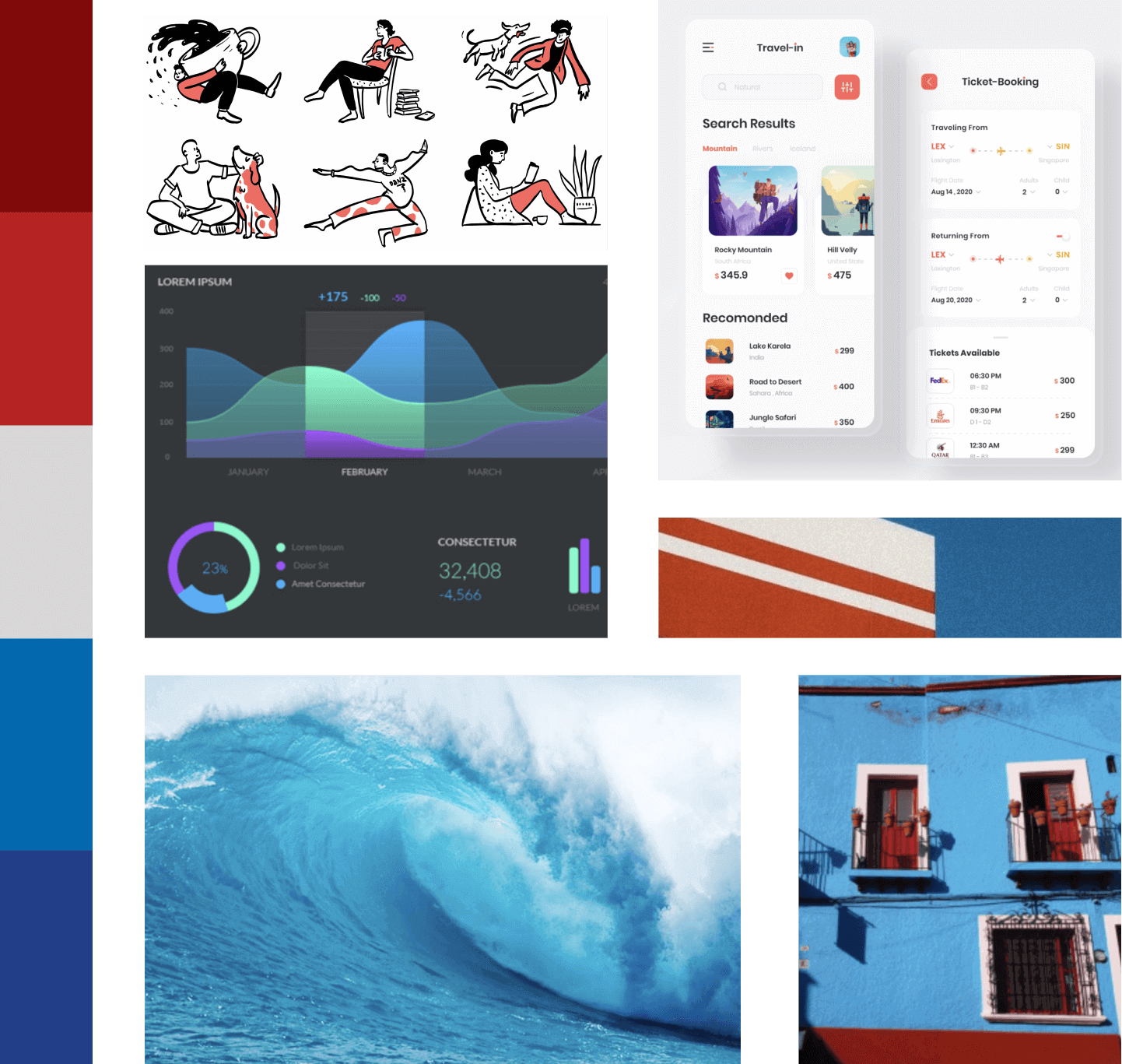
Some say creating a mood board is a bit of a wasted exercise, but I find that spending 10-15 minutes pulling together rough ideas into one pays dividends down the line.
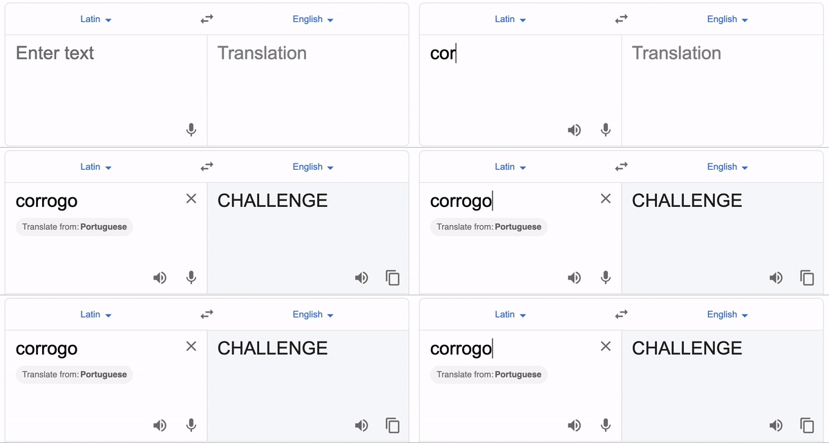
For this project the brand started with the logo and name. Keen to stand out from other fitness tracker apps, but without being unappealing to that user base, a word that most people have little association with - Corrogo - was chosen as a name.
For the logo, I initially conceptualised an abstract image of a bird, and to tie in with the theme of ancient history and mythology, and follow through with the red and blue colour scheme, I created a simple phoenix. I also thought that the message of rebirth that comes with it tied in well with a health and self-improvement service.
With the main method of navigation being a central hub I needed to create 6 easy to understand icons for buttons that would branch off into each area. I kept on theme with simple organic shapes that were most recognisable after user testing.
Note the hamburger icon for nutrition, which seems a strange choice for a health app, however after testing users said it was easily recognisable, and made them feel less judged when honestly inputting their meal data than they would be if it were an apple, for example.
In order to make the onboarding for new customers seamless I decided to start making the high quality mockups with a tutorial, which also helped shape the overall aesthetic in the end.
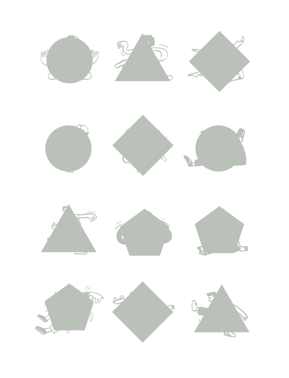
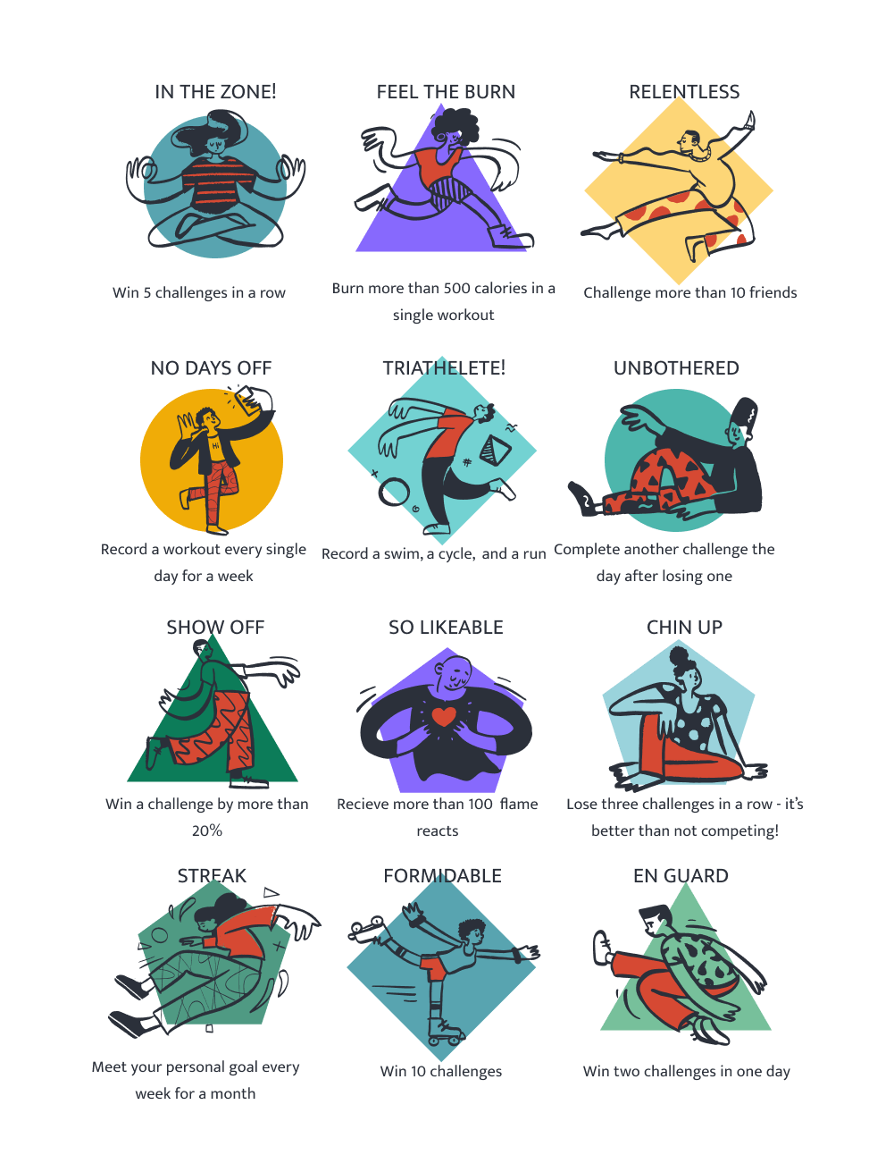
To gameify the system, I opted to focus on three main mechanisms, challenges, progress tracking, and achievements. Achievement stickers that users can place on their profile when unlocked were the missing piece that along with progress trackers incentivsed completing challenges.
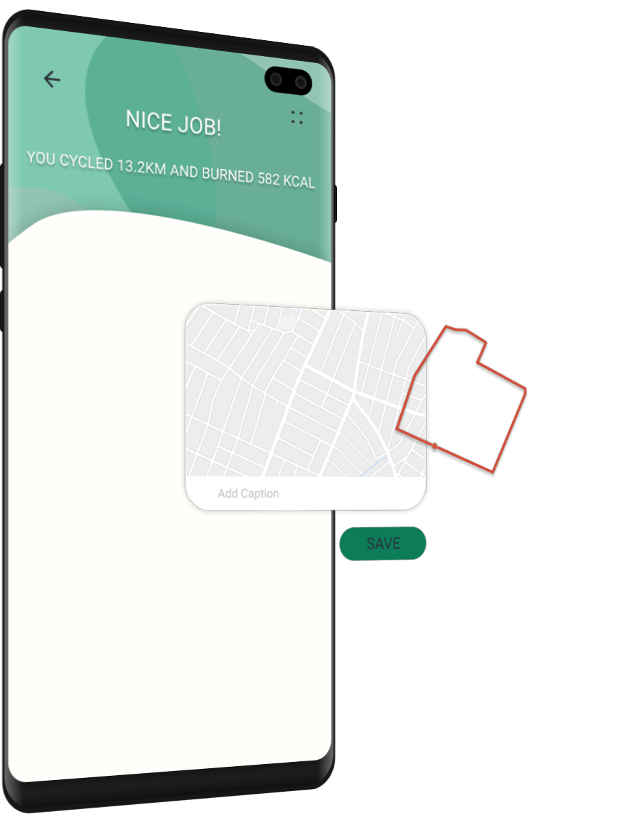
Track and record your live workouts and get instant data on calorie burn, pace and distance
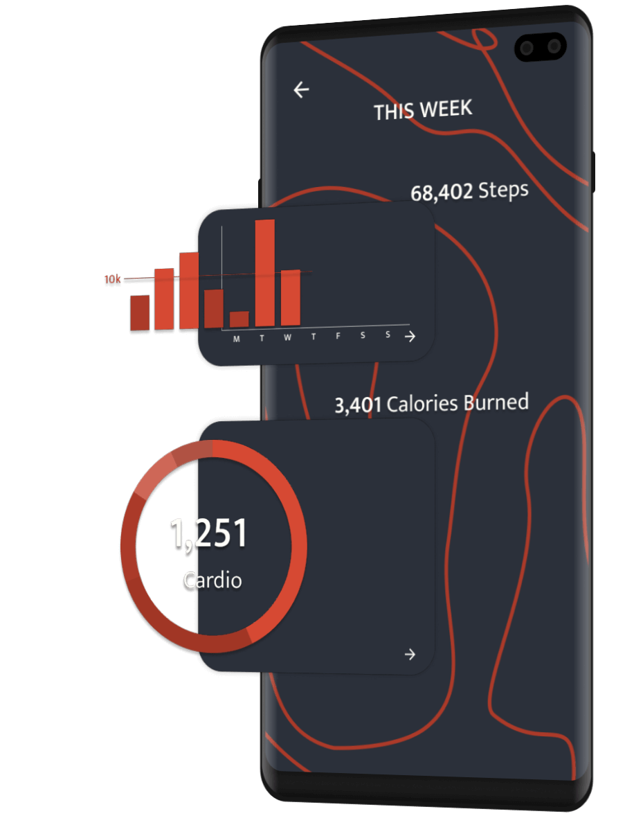
Keep track of your progress and challenges automatically, and recieve customised insights, tailor made for you
Set your goals and let Corrogo keep track of everything else, the app will show you your calorie deficit/surplus, and suggest what to eat/how to exercise to correct it
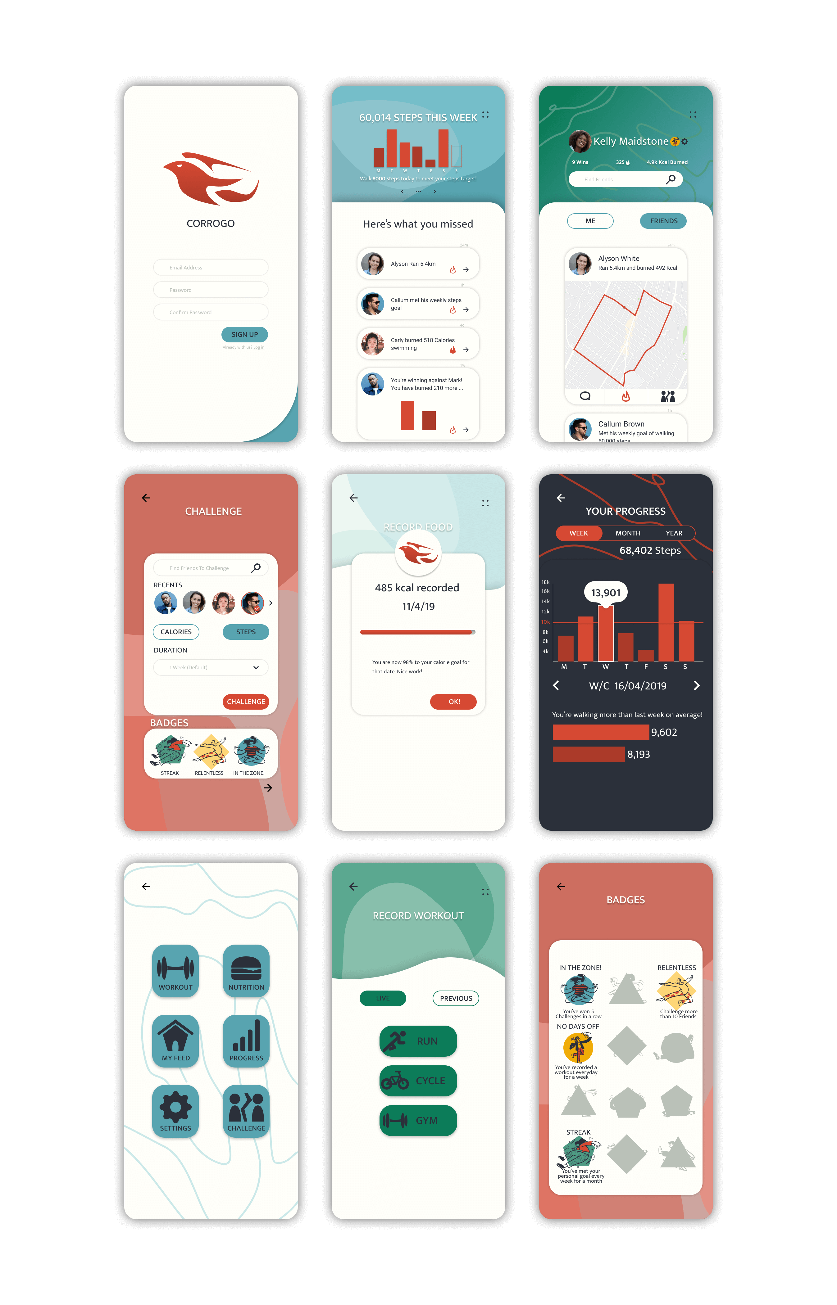
Following some further user testing, large changes were made to the design. The navigation method was tweaked slightly, I redesigned the logo and reworked the ui, shown below.
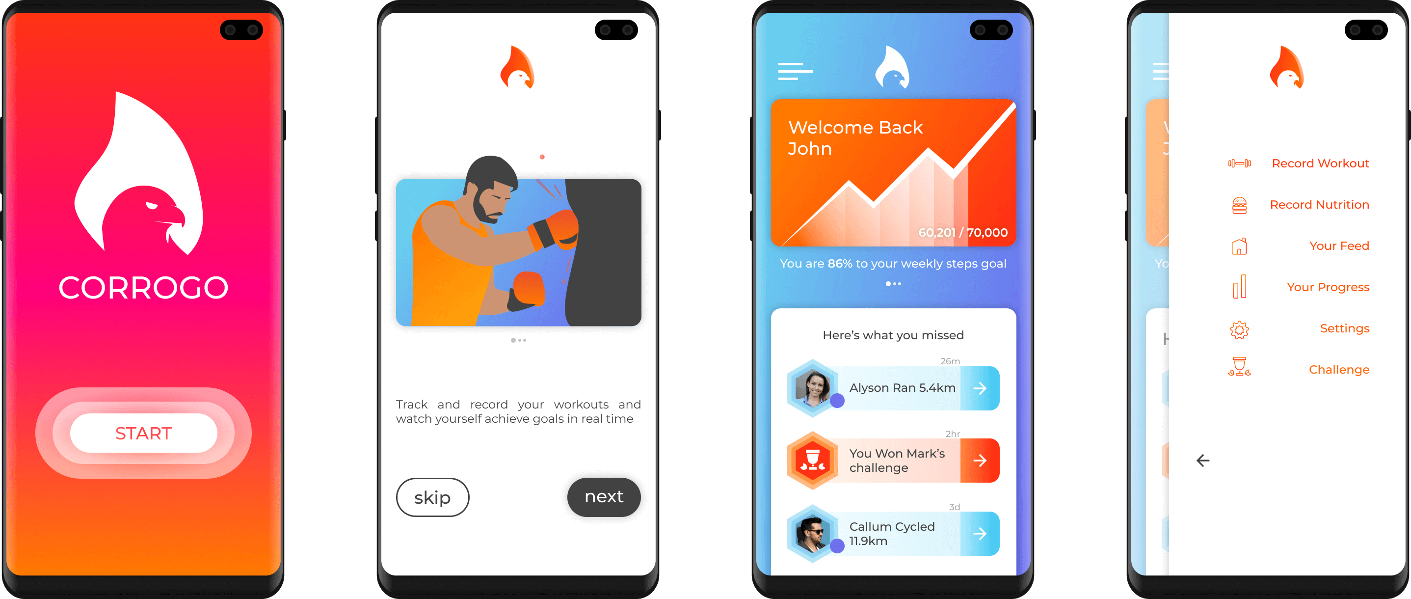
Looking back on this project, I should have doubled down on the challenge aspect sooner, and more user testing would have been beneficial to seeing this in the early prototyping stages. With help from robust animation sequences and rich illustrations, a relaxing and tactile user experience was created, with 96% of users of the prototype rating the experience as positive, ultimately deeming the project a success.